
I don’t know for sure what the key strategy behind the rebrand is or if they just wanted to refresh the visual identity to appear more modern and in tune with the times. Let’s break it down one by one, based on what we have seen so far.
The Launch Campaign:
Their initial communications on social media using influencers seems to hint at a positioning of “mutual trust” while suggesting the idea of how this trust is carried over from the older generation to the new. This is what I gathered from the scripts they gave to the influencers.

“In a world of change, trust is our mutual promise. The ✋sign and the #LineofTrust represents this timeless connection as we move towards a brighter tomorrow. Stay tuned for what’s coming next!”

“Trust is a bond that holds everything together, a mutual understanding that makes us stronger. [Personalized line about mother/friend and how much they trust them…] Similarly, MTB has been the trusted partner for millions of Bangladeshis, for more than 25 years, establishing a legacy of reliability and growth. Now, with a new outlook & a #LineofTrust, we are boldly moving together towards a brighter tomorrow!”
It uses a line (They are calling it the “Line of trust”) to resemble this connection from old to new. The visual element doesn’t add much to the story or help the positioning. In fact, before the logo reveal, I thought it was a part of the Prime NOW launch campaign which uses similar visual elements, albeit better executed and conceptually more sound.

The Logo:
If the idea behind the logo was to appear more modern and in-tune with the present, the new logo landed somewhere in between the past and the present. It is more “modern” than the previous logo but still looks like something designed in the 2010s. The ‘M’ shape it creates is okay but the styling is all over the place. The three shapes that make up the M are very inconsistent with some corners being very rounded and others being extremely sharp.
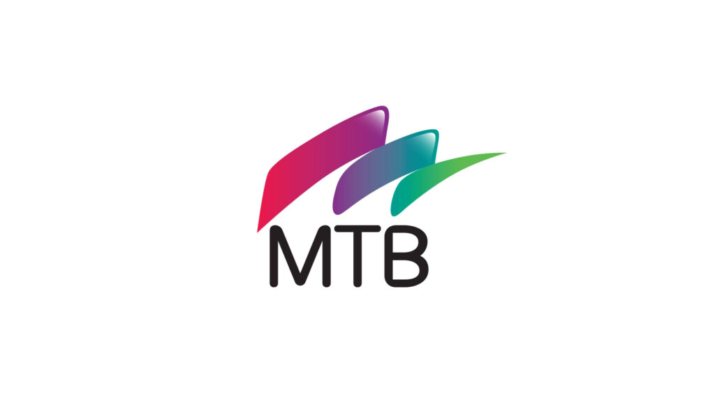
There is an overall lack of finesse in the form. There is a highlight placed on the top of the first two shapes so it looks like the highlight is on the top bit of the ‘M’ when the whole shape is observed together. However, when the logo is used in a large format, the missing highlight on the third shape makes it look like a mistake. The typeface used for the “MTB” just looks off with the B suffering from some sort of bloating problem.
Overall, the old logo was much better designed even if it was very old fashioned by today’s standards (a product of its time).
Oh and also, did I mention that the new logo is taken straight out of a stock image site?

The typography:
Along with the wordmark in the logo, the overall choice of typography is just baffling. They used a rounded, modified typeface across web and other communications. The proportions and spaces within the typeface are just wrong. It looks chunky, childish and barely legible on the web.

My guess is that this was an attempt to make a custom typeface without the time or attention needed to develop a custom typeface. Most of the letters seem like they were traced in Illustrator using ‘image trace’ and modified a bit here and there. The result is this awkward typeface with strange spacing around the stems and distorted bowls.

I don’t know about you but this exactly scream modern or polished to me. Also folks, “rounded” fonts don’t automatically equal “fun and youthful and modern”. The typeface needs to be well designed with good form to be legible and in-tune with your brand’s overall image.
Conclusion
Any kind of change is hard, no doubt about it. Whether it was to bring about a more strategic shift in the brands positioning or just a visual refresh to be in tune with a new time and promise, the execution of the whole rebrand left much to be desired. I expected better from a bank of MTB’s reputation and size. No doubt the creative team had to jump through countless hurdles including not enough time (I can guarantee this) but I expected more in 2025 from MTB.