Rebuilding a Healthcare Brand From the Inside Out
Praava Health was built to shift Bangladesh from reactive, illness-driven care toward preventive, patient-centered healthcare. The model was genuinely differentiated — a tech-enabled outpatient ecosystem with home sample collection, online consultations, and a patient portal, all designed around the experience of the patient rather than the convenience of the provider. Then the pandemic hit. Like many healthcare brands operating through COVID-19, Praava’s identity collapsed into a single association: testing. By the time the acute phase passed, the brand had lost its narrative. In the minds of patients and the wider market, Praava was a COVID-testing brand. Not the modern, multi-specialty health partner it had built itself to be.
The Problem
The challenge was not cosmetic. Praava had strong clinical capability and real product depth, but no consistent voice, no unified visual system, and no communication framework that could hold together across a billboard, a doctor’s consultation room, a social post, and a patient portal simultaneously. More fundamentally, there was a cultural problem to solve. In Bangladesh, most people seek healthcare only when something has already gone wrong. Any strategy that led with features and service listings was speaking to a market that hadn’t yet decided to show up. The brand had to do something harder: Normalize proactive care in a culture that had never been asked to think that way.
Approach
01
Shift from features to feeling
The positioning was reframed around a single idea: healthcare designed around you. This was not a tagline exercise. It became the filter for every brand decision — how the space felt when you walked in, how a doctor’s profile was written, what a patient communication sounded like, and how a campaign was structured.
02
Build the system before scaling the message
Before any campaign could be meaningful, the underlying brand infrastructure had to exist. A comprehensive brand standards system was developed from scratch — visual identity, color, typography, spatial branding, iconography, illustration, photography direction, and a full tone of voice framework. Every subsequent piece of communication was built on this foundation.
03
Create a visual language that could live everywhere
The brand needed to function across environments that were radically different — a clinic wall, a mobile screen, an outdoor billboard, a social post. A custom illustration and character system was developed to give the brand a consistent human warmth across all of these, without relying solely on photography.
04
Treat brand and product as one system
The brand had to live consistently in the physical clinic and equally across the digital product. Spatial branding, environmental signage, and the website redesign were all treated as one connected workstream, not separate projects.
Brand Identity System
The visual identity had to balance fun and creativity with a strong sense of craft and credibility. It needed to feel bold and memorable across game covers, social media, digital platforms, and merchandise. With a lean team and resources, the goal was to create a system that looked premium and professional while staying authentic to the indie spirit. The logo also needed to incorporate a rocket in a way that felt meaningful and aligned with gaming culture without becoming literal or childish.
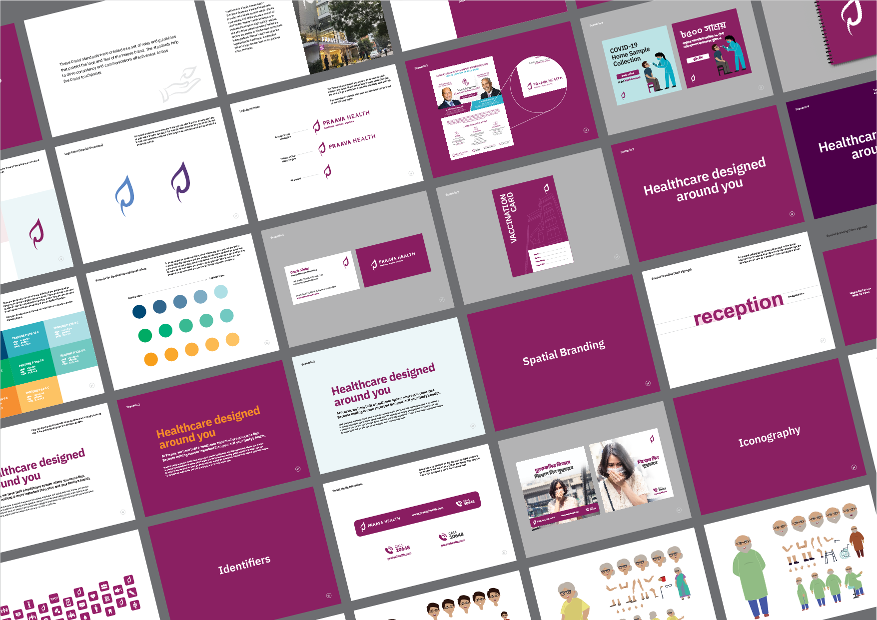
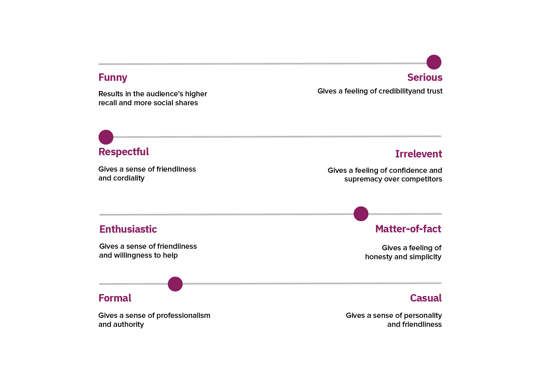
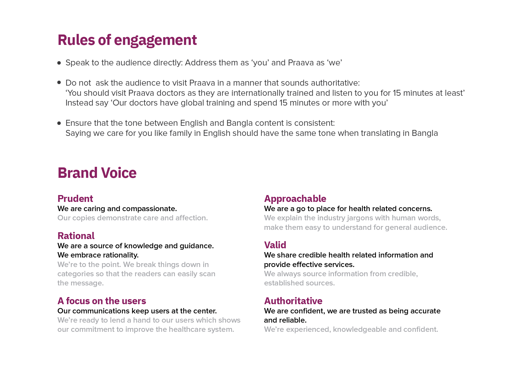
A full verbal identity framework defining how Praava speaks, not just what it says. Personality dimensions, language principles, words the brand uses and deliberately avoids, and application examples across every channel type. A brand that sounds consistent is as important as one that looks consistent.
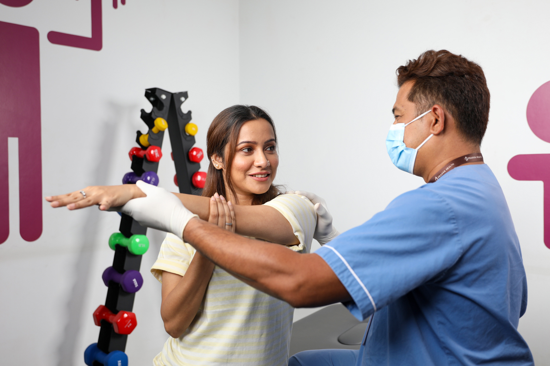
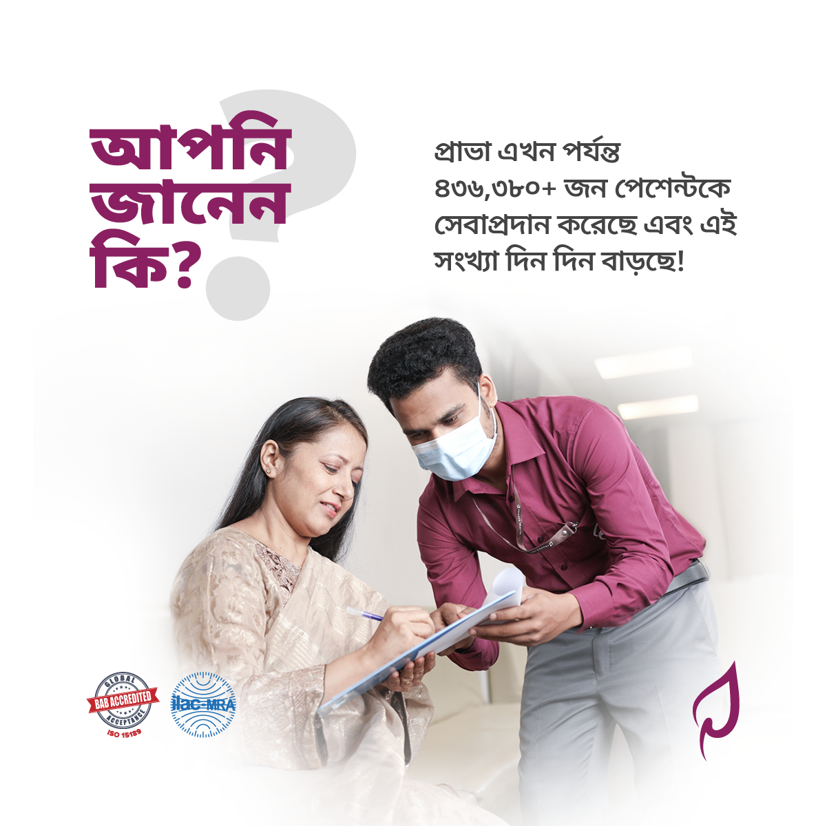
Photography Direction
A photography system built to humanize healthcare. Direction focused on warmth, trust, and real human connection — moving away from the sterile, stock-image aesthetic common in Bangladeshi healthcare marketing and toward imagery that felt genuine and approachable.

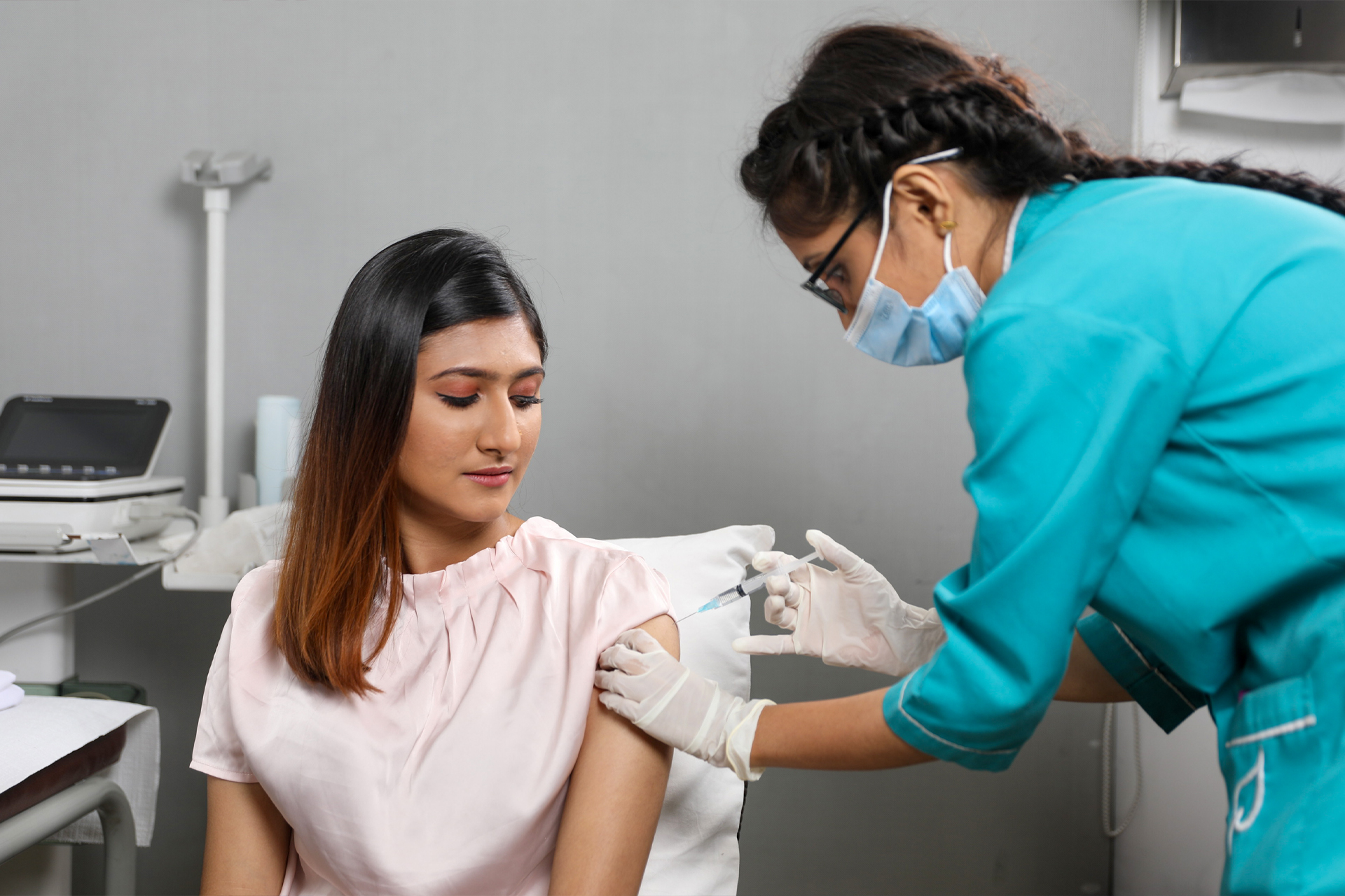
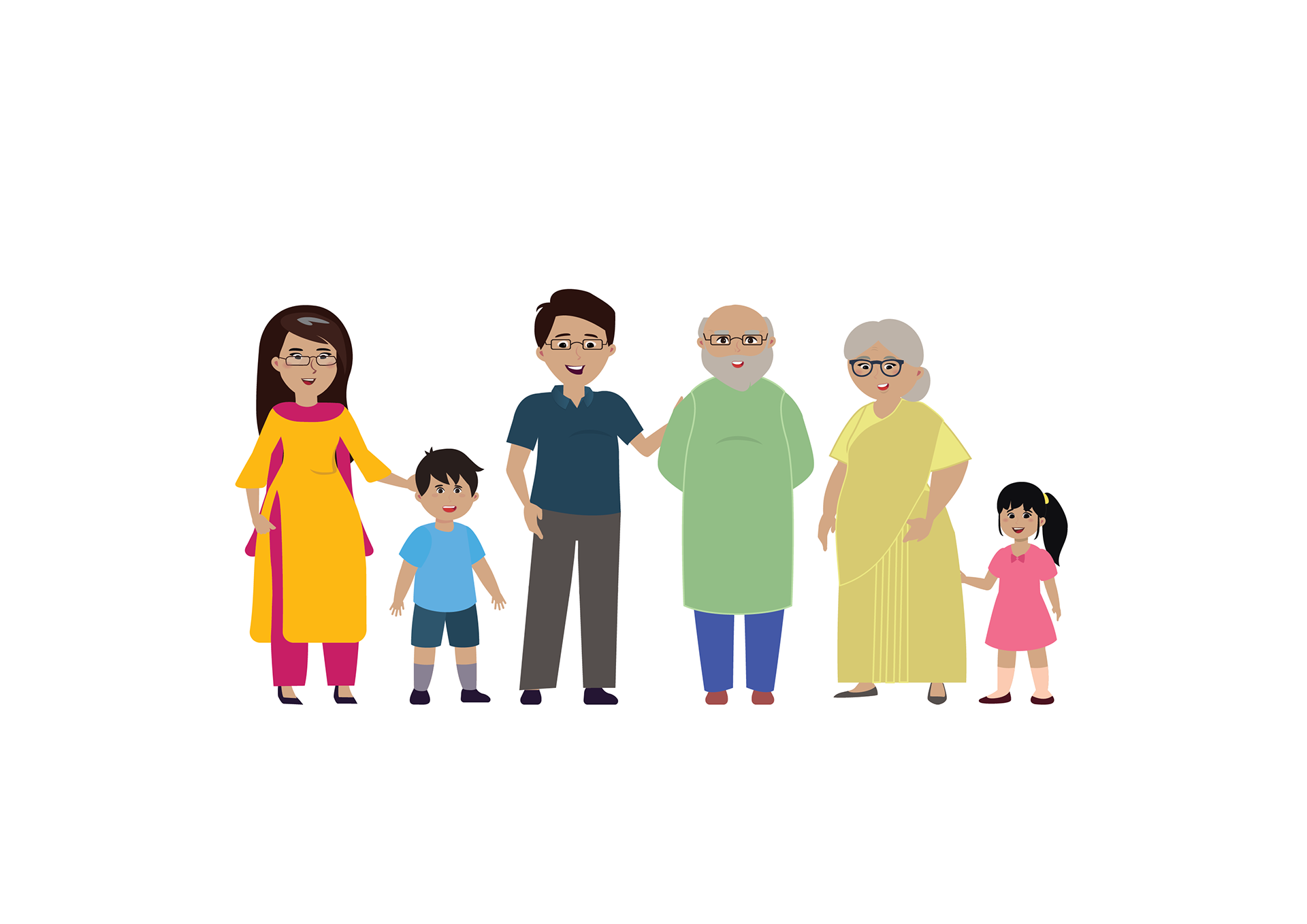
Illustration & Character System
A custom character illustration system developed to give the brand a consistent visual language wherever photography couldn’t go — campaigns, digital content, in-clinic spatial graphics, and product interfaces. Designed to reflect the diversity of Praava’s patient base while maintaining a warm, approachable visual personality consistent with the broader brand identity.

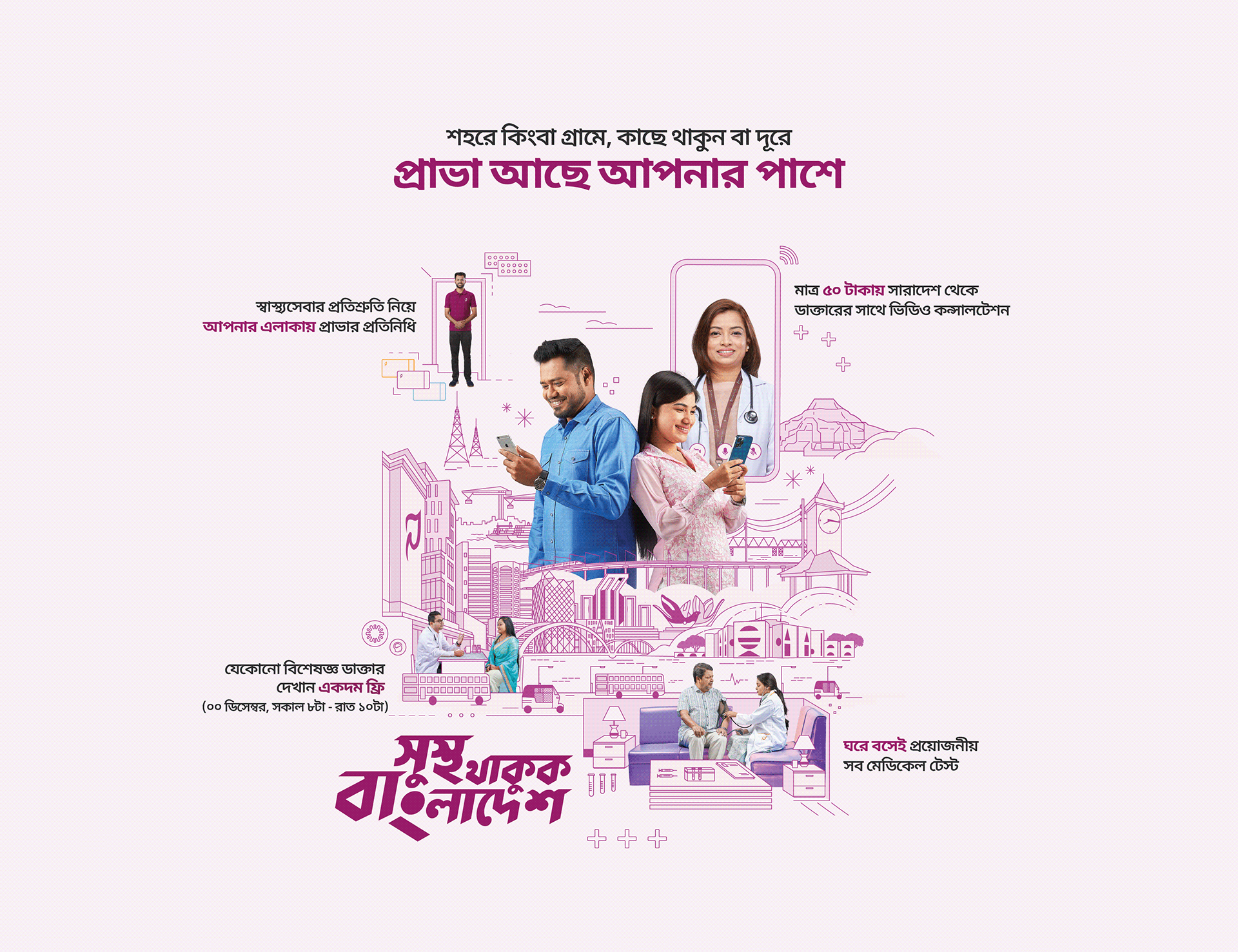
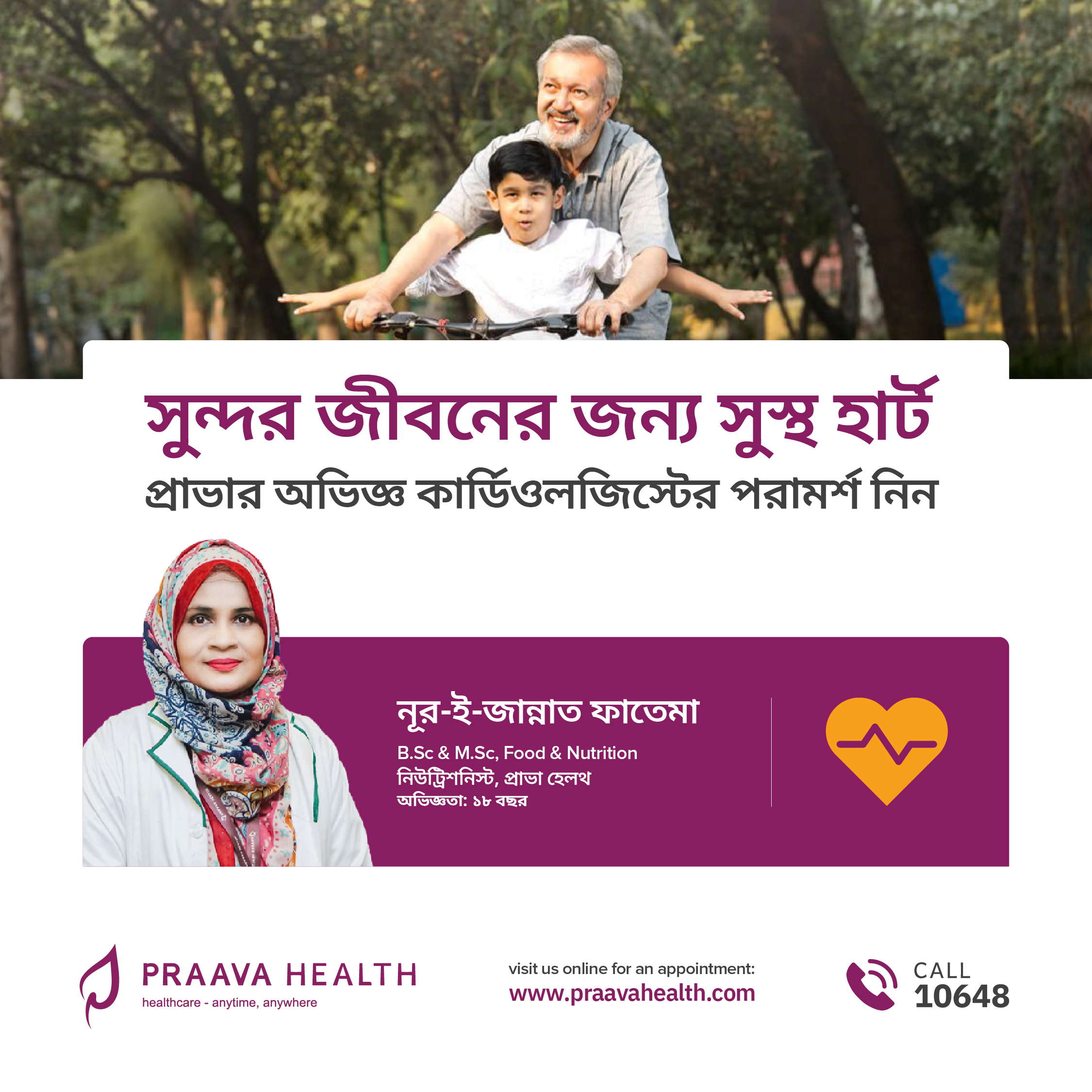
Shusto Thakuk Bangladesh
Praava’s first national integrated campaign — and the clearest expression of the brand repositioning. Rather than advertising a service, the campaign made a cultural argument: that Bangladesh as a nation could be healthier, and that proactive everyday choices made it possible. The campaign ran across digital, outdoor, and in-clinic channels, using a custom typographic identity, illustration, and film to feel warm and populist rather than clinical and institutional.
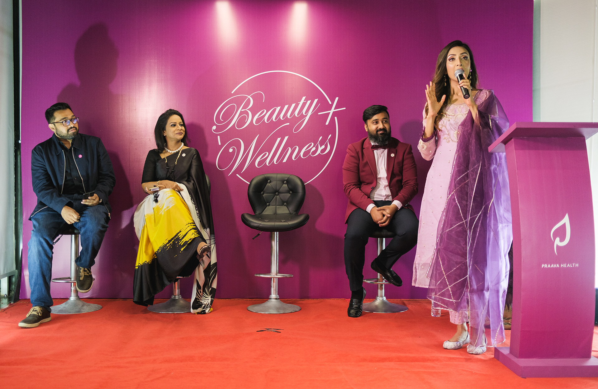
Beauty & Wellness Center
Brand identity and launch campaign for a new service vertical within Praava’s offering. The Beauty & Wellness Center required its own identity — distinct enough to stand alone, cohesive enough to sit within the Praava brand architecture. The launch event translated the brand into a physical experience, marking Praava’s entry into a new category.

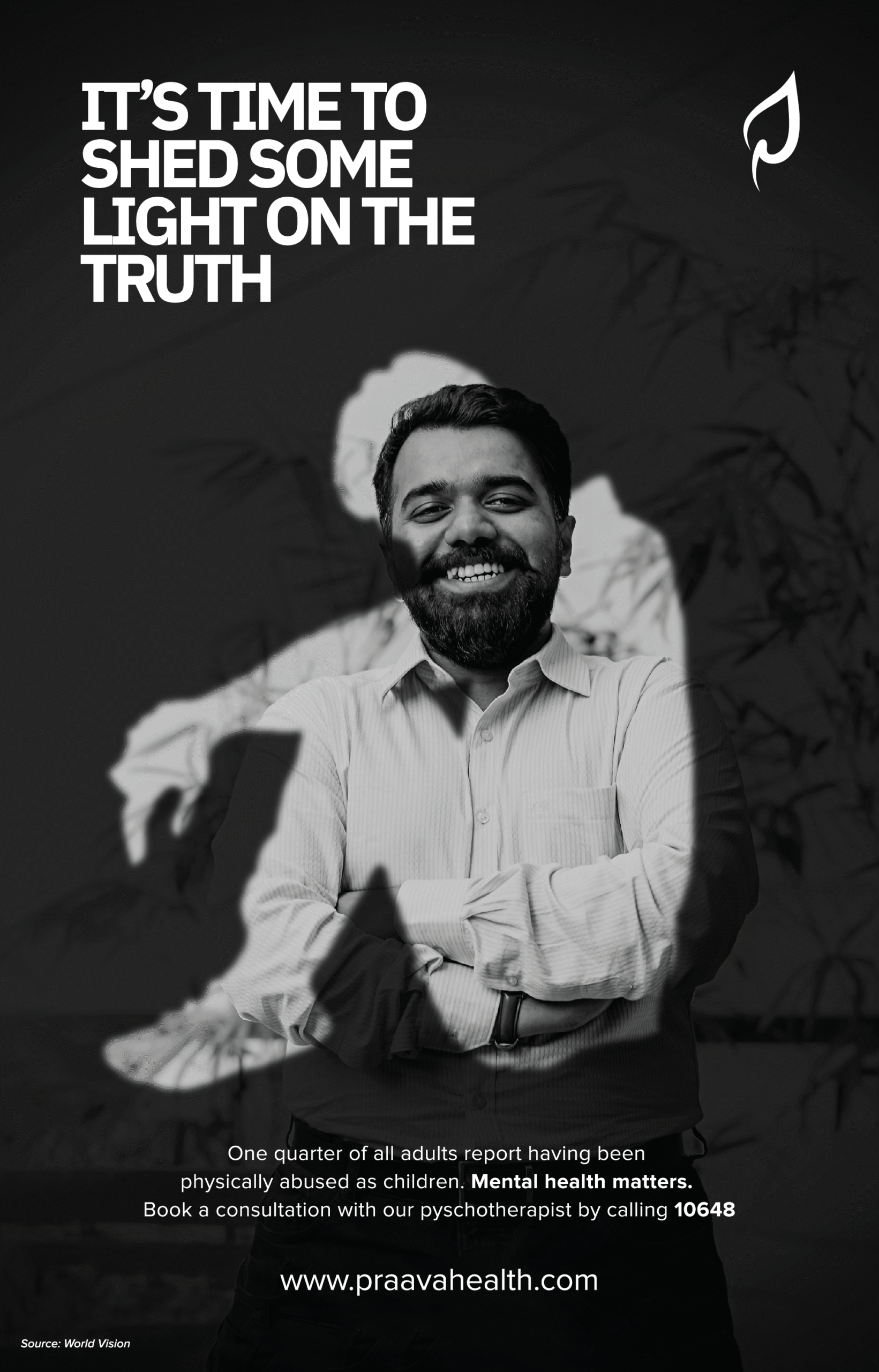
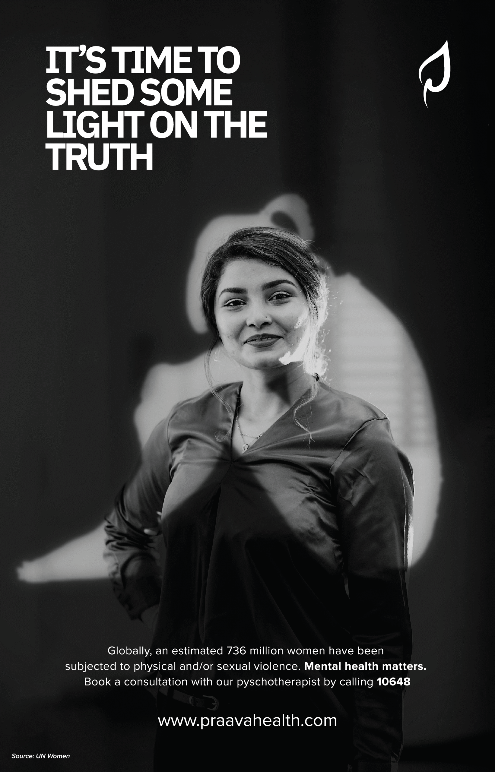
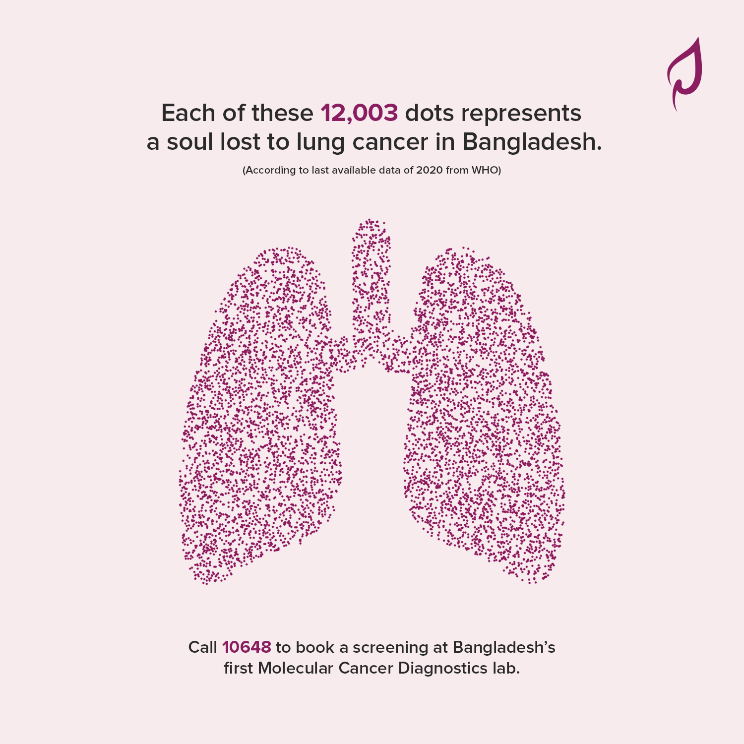
Mental Health Awareness Campaign
One of the first mental health awareness campaigns by a healthcare brand in Bangladesh. Rather than leading with clinical services, the campaign led with uncomfortable truths — global statistics on abuse, depression, and trauma — paired with human portraiture that subverted expectation. The objective was to destigmatize mental health and position Praava as a brand willing to have the conversations others wouldn’t.

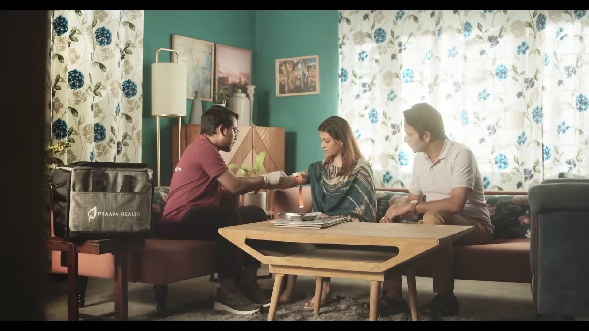
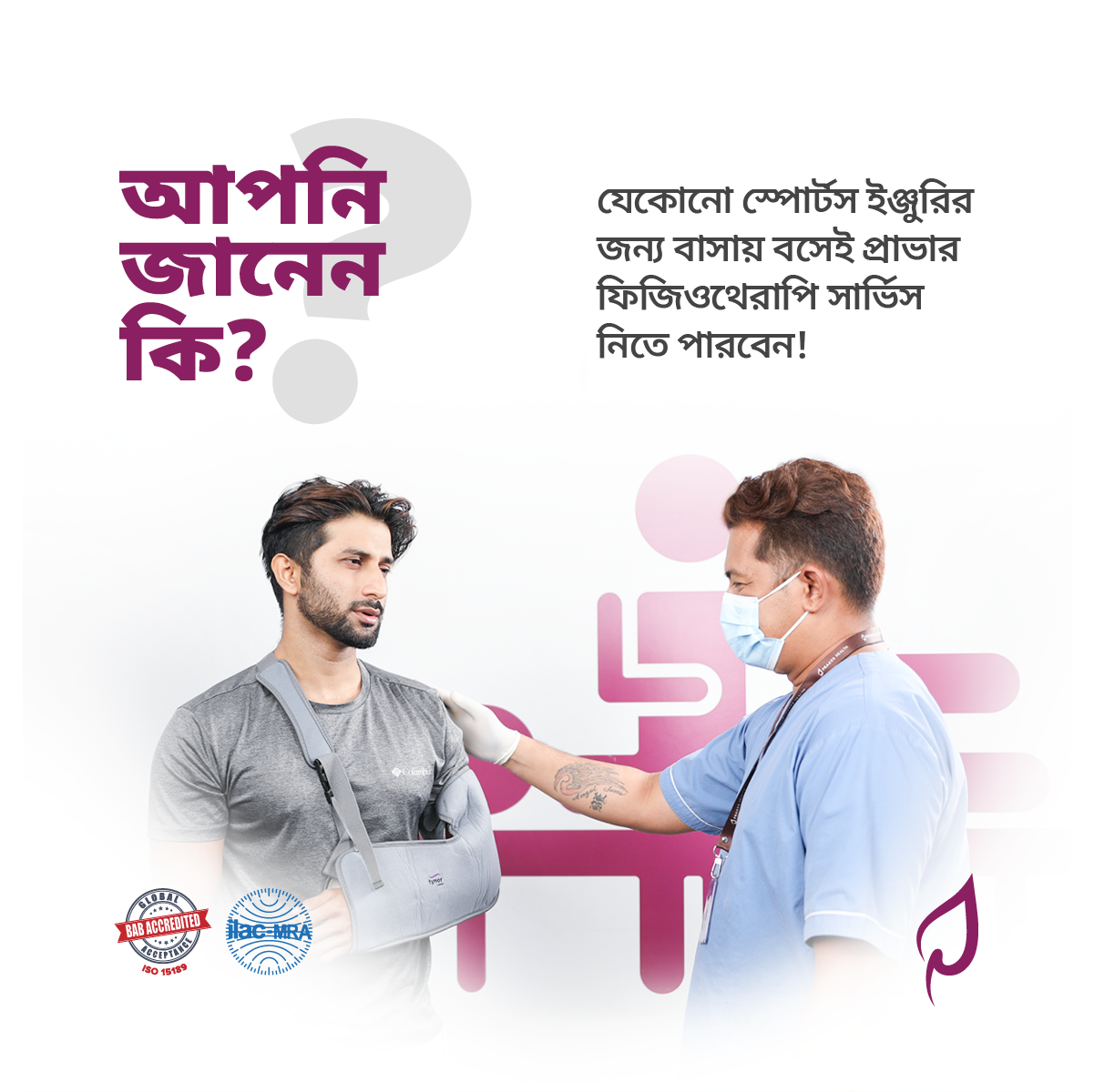
Brand Communications
Sustained brand communication across digital and physical touchpoints — doctor features, health education, FAQs, seasonal campaigns, and in-clinic materials. Built to keep the brand present, useful, and consistent between major campaign moments.


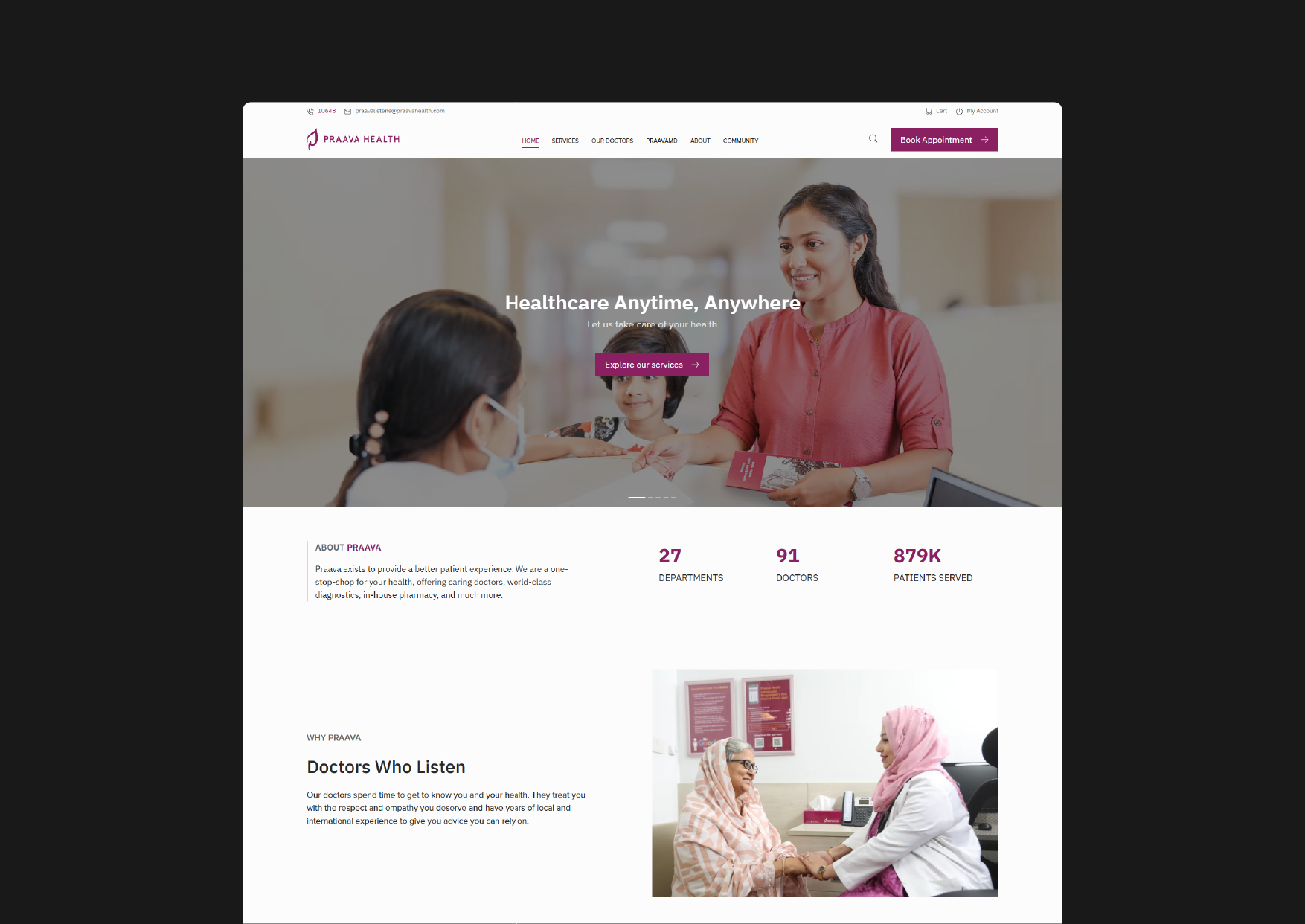
New Website
A full redesign built around one objective: making it effortless for patients to find care and act on it. Any doctor, browsable by specialty, with live availability visible upfront. Any diagnostic test or lab service, directly bookable. The site functions as both a conversion tool and a health resource. Informative enough to build trust, frictionless enough to close it.
Explore More Work
Explore More Work
Explore More Work
Explore More Work

Pocket Rocket
Pocket Rocket
Ontik